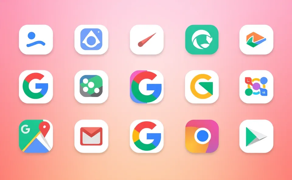
A Fresh New Look for Your Favorite Apps
If you have spent any time on your smartphone lately, you might have noticed something subtle yet striking. The colorful squares and circles we have known for years are changing. Google is currently rolling out a new gradient design across a wide range of its most popular applications. Instead of the flat, solid colors that defined the last few years, we are now seeing soft blends of colors that seem to glow or shift as you look at them.
This update is not just hitting one or two apps. It is a broad wave of Google app updates that touches everything from Google Photos to Google Maps. These Google icons now feel more fluid and organic. When you look at the new icons, you will see colors melting into one another, creating a sense of depth and softness that was missing before. It is a visual language that feels less like a digital tool and more like a living part of the screen.
For the average user, this might seem like a simple cosmetic change. However, in the world of tech design, these shifts are rarely accidental. By moving away from rigid colors and toward these shimmering gradients, Google is trying to change how we feel when we interact with their ecosystem. The goal is to make the software feel more approachable and less clinical.
Why This Design Shift is Catching Everyone’s Eye
You might wonder why a few color changes are sparking so much conversation online. The reason is that this new icon design is not happening in a vacuum. It is tied directly to the biggest trend in technology right now: Artificial Intelligence.
Google has been pushing its AI, Gemini, into almost every corner of its business. If you use Gemini, you will notice that its branding relies heavily on these same iridescent, shifting gradients. By bringing that same aesthetic to Google Photos and Google Maps, Google is creating a visual bridge. They want you to subconsciously associate these Google icons with the intelligence and power of AI.
When you see that specific gradient glow, your brain begins to recognize it as a signal. It says, “This app is now powered by AI.” It is a clever way of marking their territory in the AI race without having to put a label on every single button. People are talking about it because it marks a clear turning point in how tech companies communicate features through visuals rather than words.
From Flat Colors to Fluid Shapes
To understand why this matters, we have to look at where we came from. For a long time, the industry was obsessed with something called flat design. Everything became two dimensional. Shadows disappeared, and colors became bold and stark. Google leaned heavily into this with material design, which treated the screen like layers of digital paper.
Material design was great for clarity and speed. It made apps easy to navigate and looked clean on any screen size. But after a while, flat design started to feel a bit cold. It lacked personality. The tech world began to crave something with more soul and warmth.
This is where the transition to a more fluid user interface comes in. Google started experimenting with Material You, which allowed users to change colors based on their wallpaper. The new gradient design is the next evolution of that journey. We are moving from “flat” to “fluid.” This shift reflects a broader trend in tech design trends where the goal is to make digital spaces feel more human and less like a series of grids and boxes.
More Than Just a Coat of Paint
When a company as large as Google changes its visuals, the impact reaches further than just a pretty screen. This update is about the emotional connection between the user and the tool. Soft gradients reduce the visual tension of a screen. They make the experience feel smoother and more intuitive.
For businesses and developers, this is a signal that the era of strict, rigid UI is ending. We are entering a period where AI integration defines the look and feel of software. This means we can expect other companies to follow suit. When a design language successfully links a visual style to a powerful feature like AI, it becomes a blueprint for the rest of the industry.
Here are a few ways this impact is felt by the user:
- Visual Consistency: No matter which app you open, the shared color palette makes the ecosystem feel like one single, cohesive tool.
- Intuitive Cues: Users can quickly identify AI powered features just by looking for the gradient glow.
- Modern Appeal: The softer look aligns with modern hardware, such as OLED screens, which make these glowing colors pop with incredible vibrancy.
- Reduced Fatigue: Softer transitions between colors are often easier on the eyes during long periods of use compared to high contrast flat colors.
Where Google is Heading Next
Looking forward, it is logical to assume that this is only the beginning. We will likely see this gradient design expand even further. It is not just about the icons on your home screen. We can expect these fluid colors to bleed into the apps themselves, appearing in buttons, loading screens, and navigation menus.
As Gemini becomes more deeply integrated into the Android operating system, the line between the OS and the AI will blur. We might eventually see a user interface that changes its colors and gradients in real time based on what the AI is doing. For example, the icons might glow more intensely when the AI is processing a complex task or soften when you are in a focus mode.
The ultimate goal is a seamless experience where the design tells you exactly what the technology is capable of. We are moving toward a future where software does not just look like a tool, but feels like an assistant that is breathing and thinking along with you.
Common Questions About the New Look
Why are Google icons changing to gradients?
Google is updating its Google icons to create a softer, more modern look. This gradient design helps unify their apps and creates a visual link to their AI features, specifically Gemini, making the overall experience feel more cohesive and intelligent.
Which apps are getting the new icon design?
The new icon design is rolling out across the broader Google ecosystem. You can see these changes most prominently in Google Photos, Google Maps, and other core utility apps as part of ongoing Google app updates.
Is this change related to Gemini AI?
Yes, the move toward shimmering gradients is a deliberate choice to signal AI integration. By using the same colors found in Gemini, Google is letting users know that their apps are becoming smarter and more capable through artificial intelligence.
What is the difference between this and material design?
While material design focused on flat layers and bold, solid colors, the current trend is toward fluidity. The new look adds depth and softness, moving away from the rigid nature of early material design to something more organic and dynamic.
Will this update affect how my apps work?
These changes are primarily focused on the user interface and aesthetics. While the icons look different, the core functionality of your apps remains the same, though you may notice new AI features appearing alongside the new visuals.